
Those are the numbers to hold everything else against, and the platform average matters less than where you sit inside your own industry.
Below 10% reply on standard outreach messages is a warning sign. 10 to 15% is below average but not alarming. 15 to 25% sits on benchmark for most B2B categories.
These bands come from three sources worth trusting: LinkedIn’s own InMail response rate documentation, LinkedIn’s Talent Blog research on industry and function variation, and Expandi’s dataset covering 13.2 million connection requests. The first move for any team measuring outreach performance: stop comparing yourself to “LinkedIn average” and start comparing yourself to your actual peer group.
- Poor: under 10% reply
- Below average: 10 to 15%
- On benchmark: 15 to 25%
- Good: 25 to 30%
- Top quartile: above 30%
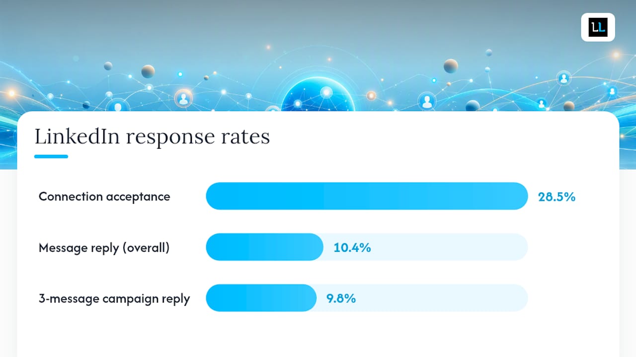
LinkedIn response rate benchmarks vary this much by channel: InMail runs 10 to 25% per send, connection acceptance averages 28.5%, and post-connection message reply lands near 10.4%, according to Expandi’s dataset.
Key Takeaways
LinkedIn response rates only mean something when measured against the right industry and function, not a single platform-wide average.
| Point | Details |
|---|---|
| Know your bands | Under 10% is poor, 15 to 25% is on benchmark, above 30% is top quartile for most outreach. |
| Channels differ sharply | Connection acceptance averages 28.5%, message reply about 10.4%, InMail 10 to 25% per send. |
| Three messages beats five | Campaigns with three messages hit roughly 9.8% reply; longer sequences often underperform. |
| Message length has a sweet spot | Replies peak around 151 to 200 characters, well under LinkedIn’s 400-character InMail guidance. |
| Sample size protects your data | Treat anything under 100 to 150 sends as unreliable for benchmarking decisions. |
Table of Contents
- LinkedIn Outreach Efficiency Benchmarks by Channel
- How Do Response Rates Vary by Industry and Role?
- What Actually Moves the Needle on Reply Rates?
- How to Measure Your LinkedIn Response Rate Correctly
- A Practical Playbook to Raise Your Reply Rate
- How The Lead Lab Applies These Benchmarks in Client Campaigns
- Why Most Teams Benchmark Themselves Against the Wrong Number
- Sources
LinkedIn Outreach Efficiency Benchmarks by Channel
Every channel on LinkedIn plays by different rules, and lumping them into one “response rate” number is how teams end up chasing the wrong fix. Connection requests, connection-note replies, post-connection messages, and InMail each carry a distinct baseline, and the gap between them tells you where your budget is actually working.
- Connection request acceptance. Expect roughly 28.5% acceptance on cold connection requests, based on the 13.2 million requests Expandi analyzed. Acceptance measures willingness to connect, not interest in your offer, so treat it as a top-of-funnel gate rather than a success metric.
- Connection-note reply. Replies to connection-request notes occur at a relatively low rate when a short note is attached. Most conversation happens after acceptance, in the follow-up message, not in the request itself.
- Post-connection message reply. Once someone accepts, first-message reply rates average around 10.4%, roughly triple the connection-note figure, because the recipient already recognizes your name.
- InMail per-send reply. LinkedIn’s own documentation puts typical InMail response somewhere in the 10 to 25% range, with Recruiter accounts often held to a 13% internal benchmark, per LinkedIn’s help center.
The cost math matters here. Volume-friendly channels usually win on total replies even when their per-send percentage looks lower.
How Do Response Rates Vary by Industry and Role?
LinkedIn’s Talent Blog research on industry and function variation shows some sectors and job functions running well above the platform baseline, while others sit consistently lower no matter how good the copy is.
- Staffing & Recruiting: typically the highest-responding industry, since recipients are often actively job-seeking or used to InMail outreach as a normal part of their week.
- Marketing & Advertising: moderate response, usually near or slightly above the platform average, reflecting an audience that expects cold outreach but filters aggressively.
- Computer Software: often below average, especially at senior technical roles, because engineering and product leaders get flooded with vendor pitches.
- Financial Services: mixed, with compliance-heavy roles responding lower and business-development roles responding closer to benchmark.
Function matters as much as industry. HR and recruiting contacts tend to respond above average because outreach fits their job description, while C-level executives and software engineers trend lower, since both groups get disproportionately targeted and have learned to ignore volume. Independent datasets, including LinkedInsider’s aggregated benchmarks, corroborate this pattern across separate samples.
What Actually Moves the Needle on Reply Rates?
Four levers explain most of the variance between a mediocre campaign and a good one, and none of them require a bigger budget.
- Message length. Expandi’s cohort analysis found messages between 151 and 200 characters outperform both shorter and longer versions, and LinkedIn’s own guidance recommends keeping InMails under 400 characters entirely.
- Campaign length. Three-message sequences hit a sweet spot near 9.8% reply, according to Expandi’s H2 state report. Sequences of five or more messages often perform worse than a single well-targeted message, because recipients start tuning out repeat senders.
- Personalization and targeting. Generic templated openers underperform messages referencing something specific to the recipient’s role or recent activity. Tight targeting and account warm-up (gradually increasing daily connection volume on a new profile) both reduce the flagging that suppresses delivery and reply.
- Timing. Roughly 65% of InMail responses arrive within the first 24 hours, and about 90% arrive within a week, per Expandi’s data. Waiting longer than seven days to follow up on silence rarely produces a late reply.
Pro Tip: *Build your follow-up cadence around the response window, not around your own schedule.
How to Measure Your LinkedIn Response Rate Correctly
Bad measurement produces bad benchmarks, and most teams get the denominator wrong before they even get to the message copy.
- Define your metrics precisely. Acceptance rate = connections accepted ÷ requests sent. Message reply rate = replies received ÷ messages delivered. InMail response rate = replies within 30 days ÷ InMails sent, using LinkedIn’s own 30-day window.
- Separate raw replies from positive replies. A “not interested” and a “let’s talk Tuesday” both count as replies, but only one predicts pipeline. Tag each reply by intent before reporting a single blended number.
- Set a minimum sample size. Anything under 100 to 150 sends produces noisy, unstable percentages. A 20% reply rate on 10 messages is not a benchmark, it’s a coin flip, as Warmerly’s measurement guidance points out.
- Use a consistent 30-day reporting window so campaigns launched at different times stay comparable, and avoid switching denominators mid-report (sent vs. delivered vs. accepted) between updates.
A Practical Playbook to Raise Your Reply Rate
Fix these in order, because each one compounds on the last, and skipping straight to message copy while your targeting is loose wastes good writing on the wrong recipients.
- Tighten targeting first. Narrow your list with Sales Navigator filters (seniority, company size, recent job change) before touching a single word of copy. Segmentation strategy fixes more reply problems than message rewrites do.
- Fix profile credibility. A complete headline, a real photo, and recent activity all reduce the “who is this” hesitation that kills replies before the message even gets read.
- Rewrite the first line and subject. Short, personalized openers referencing the recipient’s role or a recent post beat generic pitches. See message copy principles for structure.
- Run a disciplined three-message cadence with four to six days between touches, matching the sweet spot Expandi’s research identified.
Three A/B tests worth running immediately:
- Message length: 100 to 150 characters vs. 151 to 200 characters, minimum 150 sends per arm, KPI = reply rate.
- Subject line: personalized (mentions company or role) vs. generic, same message body, minimum 150 sends per arm, KPI = open-to-reply ratio.
- Cadence: two-touch vs. three-touch sequence, same targeting list split randomly, KPI = positive reply rate, not raw reply rate.
Pro Tip: Measure ROI as positive reply → booked meeting, not reply → any response. A campaign with a lower raw reply rate but a higher meeting-booked rate is the better campaign, full stop.
Once targeting, profile, and cadence are dialed in and reply rates still lag, that’s usually a capacity problem, not a strategy problem. Learn from common outreach mistakes before deciding whether to scale in-house or bring in a managed provider.
How The Lead Lab Applies These Benchmarks in Client Campaigns
The Lead Lab uses industry and function benchmarks to set expectations before a campaign launches, not after.
- Cadence and targeting get tiered by industry benchmark data, not a flat template applied to every client.
- Response tagging separates positive replies from polite declines from the first week of a campaign, so reporting reflects pipeline impact rather than raw volume.
- Managed campaigns give teams without the internal bandwidth to run A/B tests and cadence experiments a faster path to benchmark performance.
Benchmarks only help if you know which peer group you’re being measured against. A recruiting firm chasing a software company’s response rate is solving the wrong problem entirely.
Teams weighing whether to run this in-house or hand it to a done-for-you outreach partner should look at their own bandwidth for testing, not just their budget. Explore The Lead Lab’s portfolio for examples of how tiered targeting and message testing play out across different professional services categories, and see outreach campaign ideas for structures worth testing before committing to a full campaign build. For teams building message sequences from scratch, Crono’s guide to LinkedIn DM outreach offers additional cadence and template structure worth reviewing alongside benchmark data. And when the internal math stops adding up, that’s the point to talk to The Lead Lab about a managed campaign built around your specific industry benchmark, not a generic platform average.
Why Most Teams Benchmark Themselves Against the Wrong Number
The biggest mistake in how marketing and sales teams use these benchmarks isn’t the tactics, it’s the comparison. Nobody sits at “the platform average” because there’s no such recipient. A recruiter messaging candidates and a sales rep messaging CFOs are running entirely different experiments that happen to share a website.
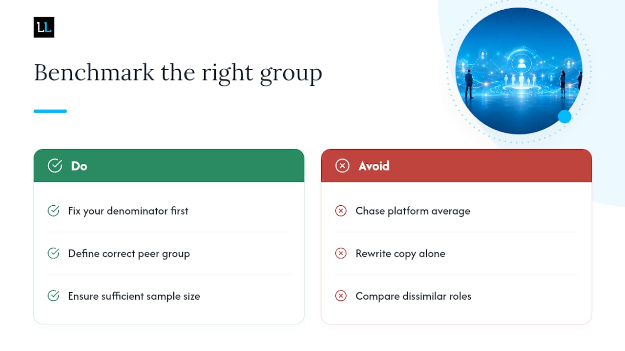
If you take one thing from this data, prioritize fixing your denominator before you fix your copy. Most teams rewrite messages for months chasing a benchmark they were never going to hit, because the underlying sample was too small or the peer group was wrong from the start. Get the measurement right first. Everything else, cadence, personalization, subject lines, is a smaller lever than most people assume.
Sources
- InMail response rate | LinkedIn Help
- LinkedIn Outreach Benchmarks 2026: 13.2M Data Points
- State of LinkedIn Outreach H2 2026 | Expandi Data Report
- LinkedIn Response Rate Benchmarks: What Good Actually Looks Like | Warmerly